Midland Realty
- Visual Identity
About Project
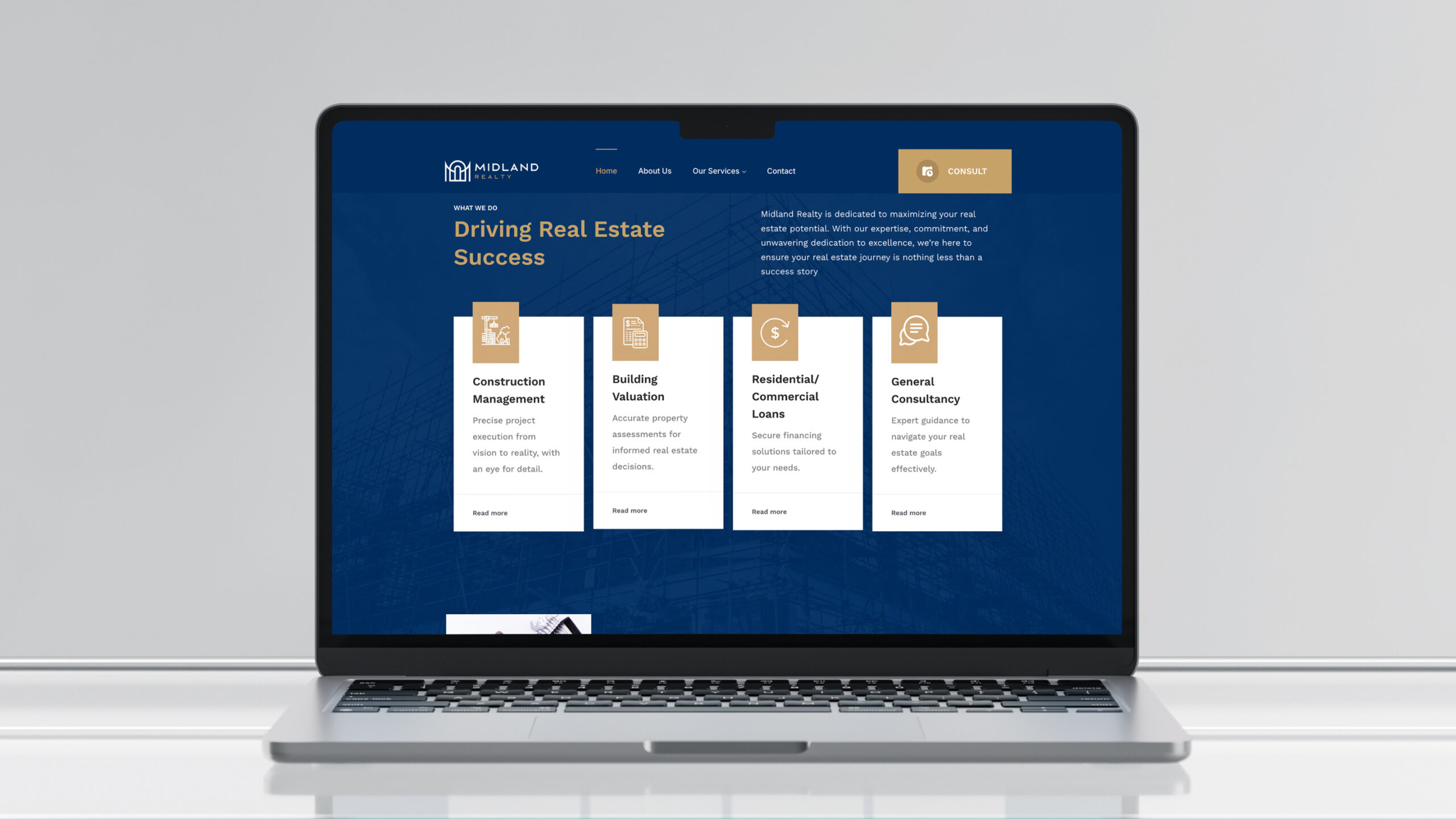
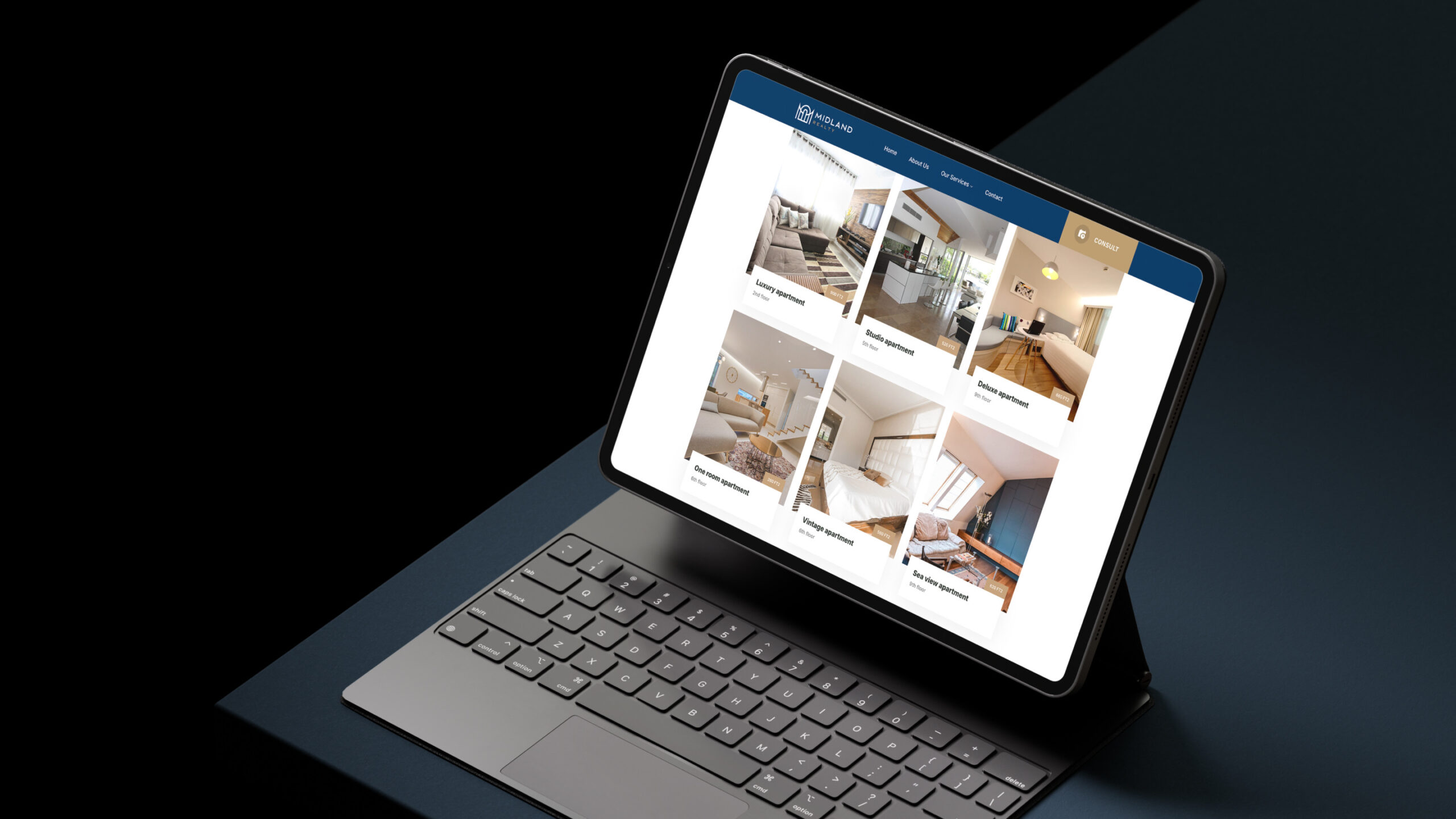
Midland Realty, is into real estate, construction, and consultation.
Their differentiation is in ensuring client satisfaction, executing to the core at reasonable fees. With a unique focus on church buildings and commercial properties, it excels in providing creative constructions. It wears its heart on its sleeve, boasting qualities of loyalty, courtesy, and efficiency that define its character.





Concept
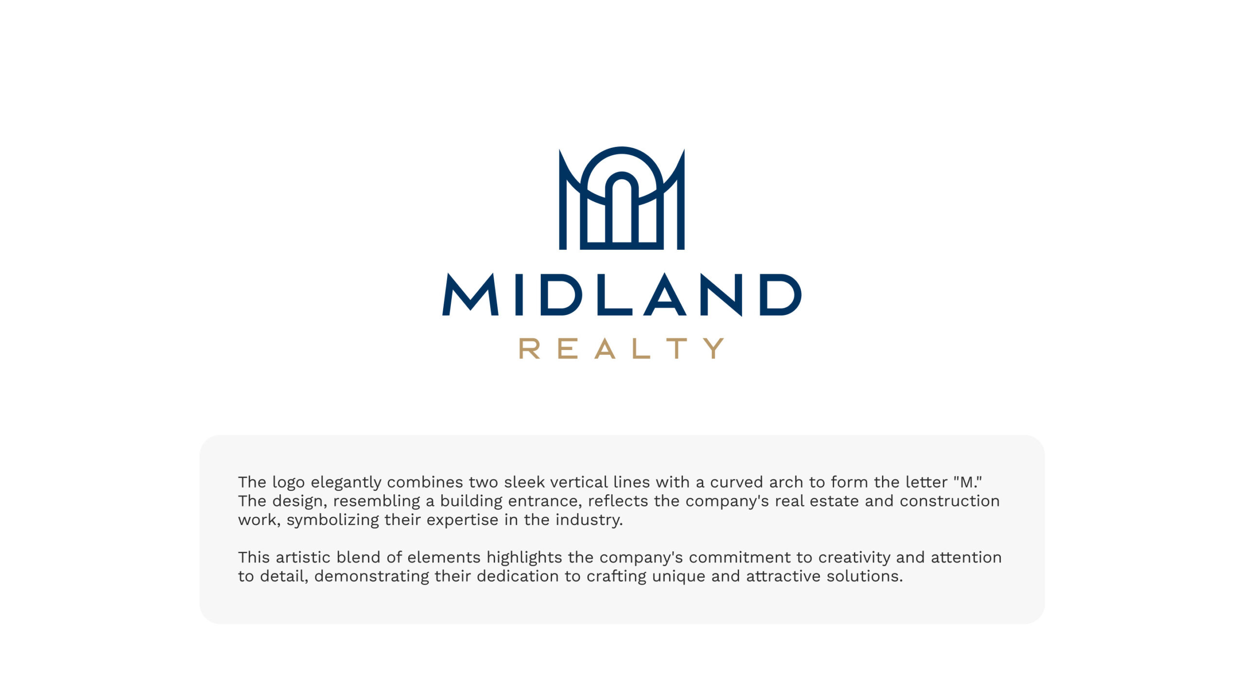
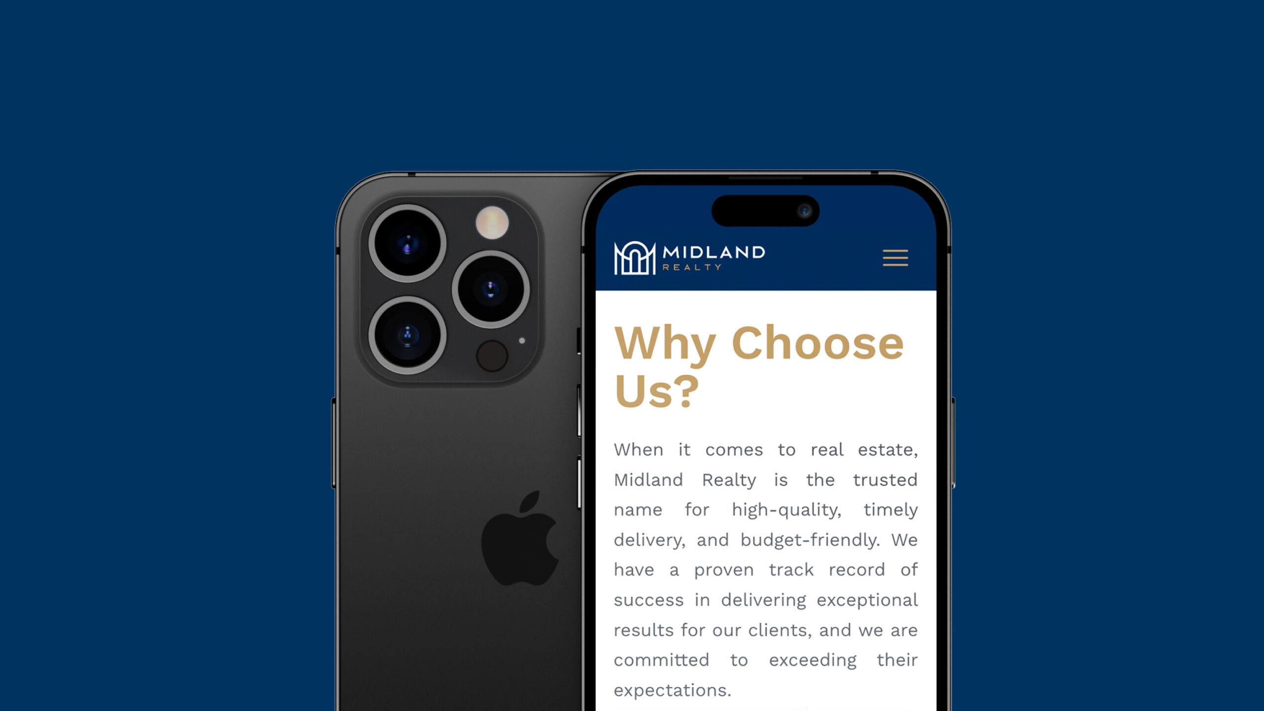
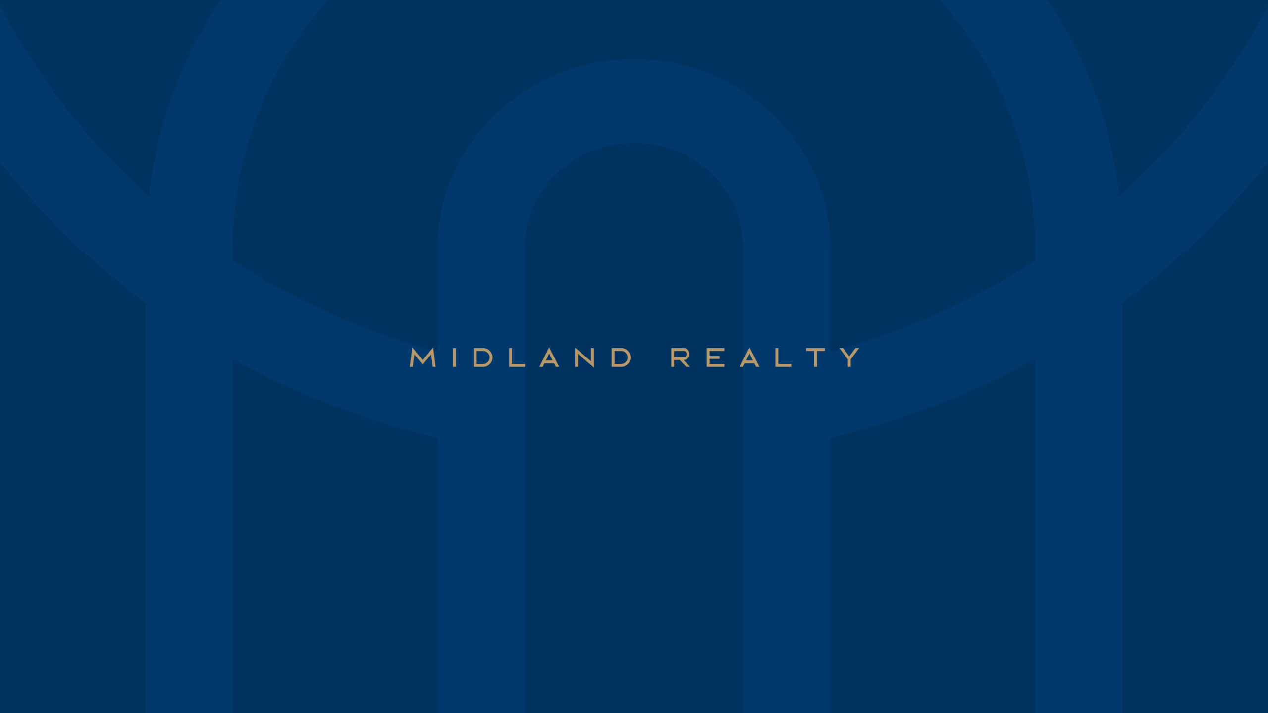
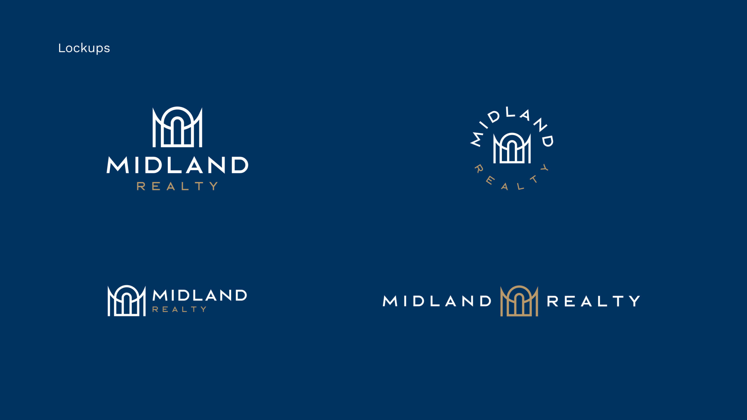
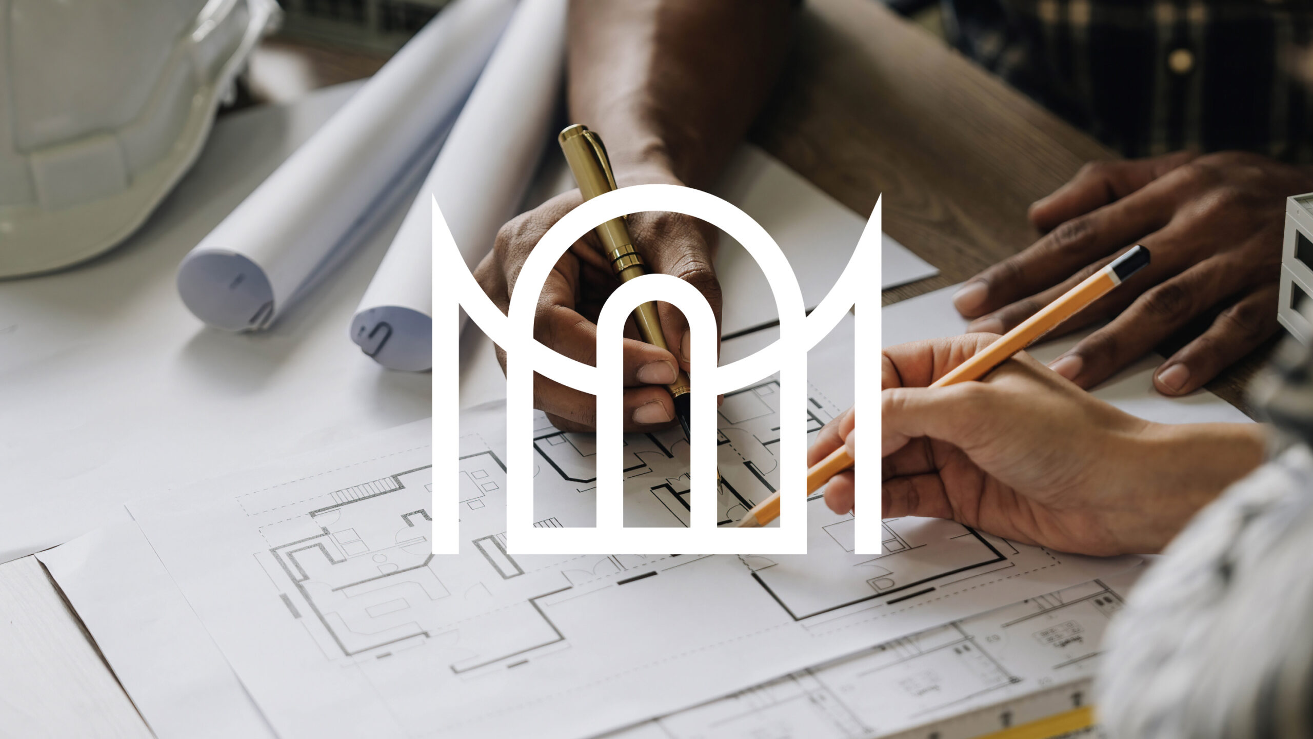
The logo elegantly combines two sleek vertical lines with a curved arch to form the letter “M.”
The design, resembling a building entrance, reflects the company’s real estate and construction work, symbolizing their expertise in the industry.
This artistic blend of elements highlights the company’s commitment to creativity and attention to detail, demonstrating their dedication to crafting unique and attractive solutions.
