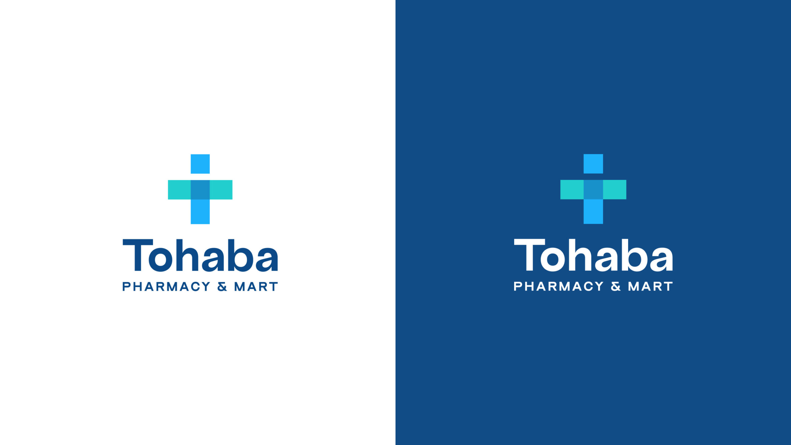
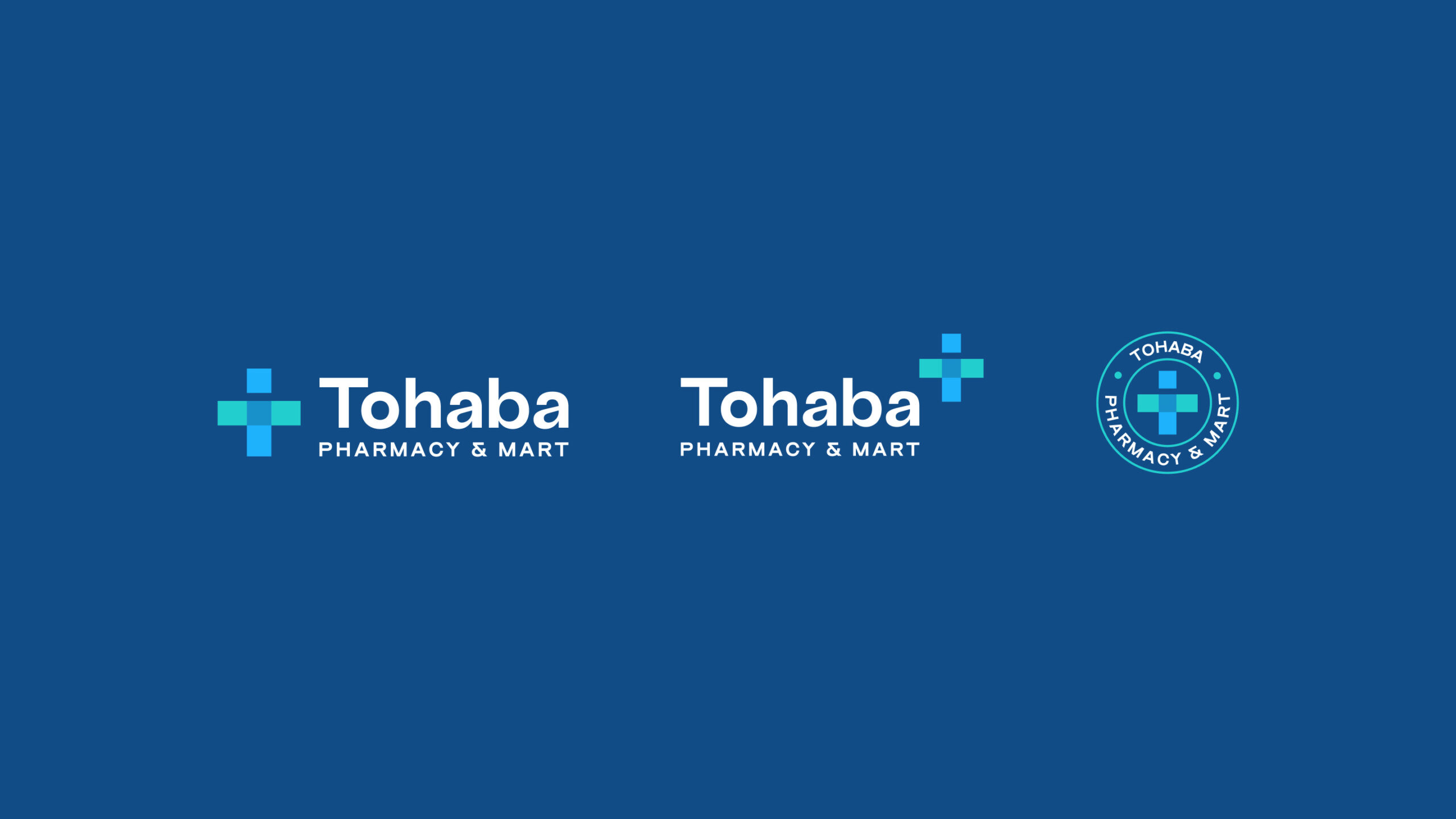
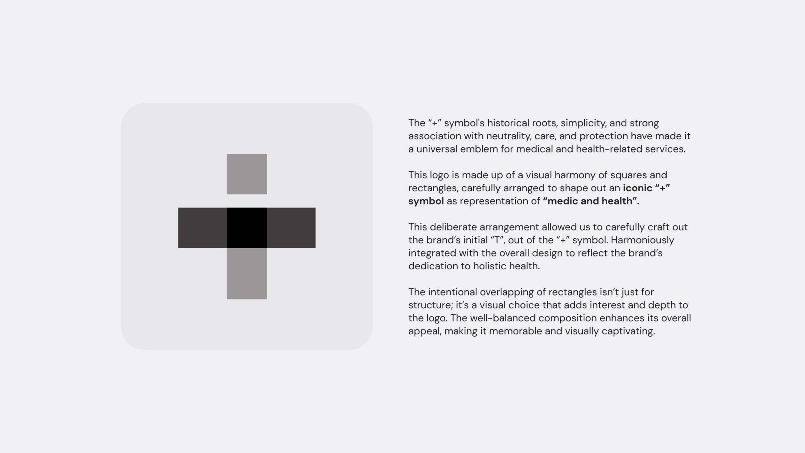
The “+” symbol’s historical roots, simplicity, and strong association with neutrality, care, and protection have made it a universal emblem for medical and health-related services.
This logo is made up of a visual harmony of squares and rectangles, carefully arranged to shape out an iconic “+” symbol as representation of “medic and health”.
This deliberate arrangement allowed us to carefully craft out the brand’s initial “T”, out of the “+” symbol. Harmoniously integrated with the overall design to reflect the brand’s dedication to holistic health.
The intentional overlapping of rectangles isn’t just for structure; it’s a visual choice that adds interest and depth to the logo. The well-balanced composition enhances its overall appeal, making it memorable and visually captivating.